
Washington Post: Cultivating Gen Z Connection
Turning childhood memories into lifelong relationships
Context
This project reframes Gen Z acquisition not as a short-term conversion problem, but as a long-term, trust-based, and joyful learning relationship that begins in childhood.
Role: UX Strategist/Researcher/Designer
Methods:Interviews | Co-design with kids | Prototype testing
Strategy
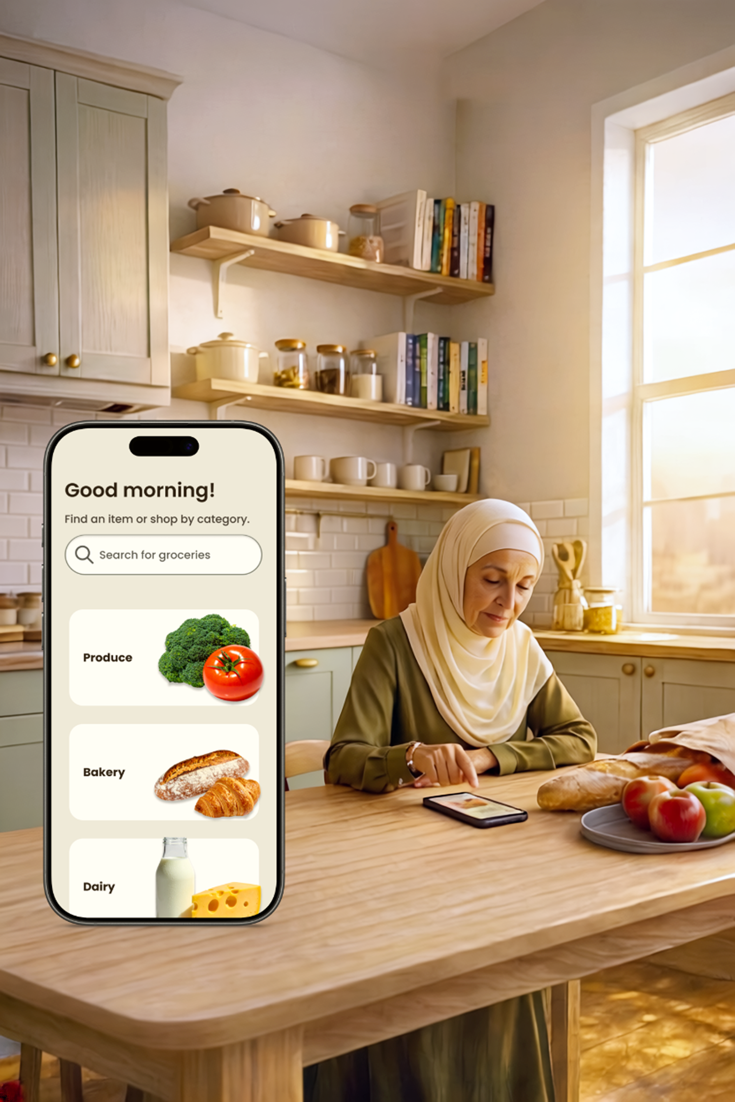
Challenge
While The Washington Post revolutionized its technological infrastructure, it struggled to build a relationship with Gen Z readers. This generation seeks instant access, visual storytelling, and a sense of community.
Approach
Rather than treating Gen Z acquisition as a short-term conversion problem, I explored how brand loyalty develops over time, particularly through emotional associations formed in childhood.
This led me to identify an underutilized kids’ section within The Washington Post and reimagine it as a positive, age-appropriate entry point to the brand.
Design Question
How might we help The Washington Post build meaningful emotional connections with younger audiences that grow into long-term trust and loyalty?
Prototype to Learn
Key Decisions
Prototype high-fidelity early
Kids respond to what they can see and interact with, not abstract descriptions. High-fidelity screens enabled more honest reactions, clearer confusion points, and richer emotional feedback.
Test concepts before usability
The goal at this stage was desirability and emotional resonance, not polish. Validating interest, motivation, and joy came before optimizing flows.
Use design as a dialogue tool
The prototype was a prompt for discussion, imagination, and co-creation, helping surface ideas and language children wouldn’t articulate in interviews alone.
With these principles in mind, I examined the existing KidsPost experience, made intentional decisions about my approach, and designed a prototype to explore whether a more playful, agency-focused experience could foster emotional connection early on, before refining usability and interaction details.
Understanding the Existing KidsPost Experience
While familiarizing myself with The Washington Post app, I came across KidsPost, a small, almost hidden section buried under Lifestyle. Its placement alone suggested it wasn’t treated as a core experience. The content reinforced that impression: the tone and layout were very “grownup”.
This discovery, combined with insights from my desk research on nostalgia as a driver of purchase decisions and brand loyalty, sparked a key question: what if the KidsPost became a fun, engaging space that builds emotional connection early on? The idea of redesigning it wasn’t just about improving usability; it was about transforming it from an overlooked corner into an experience that could nurture lasting affinity with the brand.
This decision turned the project into an experiment in learning through making. The prototype was not a finished solution; it was a tool for learning.
Deciding on the Approach
Recognizing how hidden and “serious” the KidsPost felt within the existing app, I realized that this challenge wasn’t just about improving findability; it was about building an engaging experience that kids could relate to and form a community around.
Rather than beginning with traditional user interviews, I chose to prototype first. Creating a high-fidelity concept early on allowed me to express an alternative vision and gather richer feedback from users once they could see and imagine it. The design became a conversation starter, a way to uncover what drew kids in, what felt confusing, and what could nurture long-term interest.
Designing the New Experience
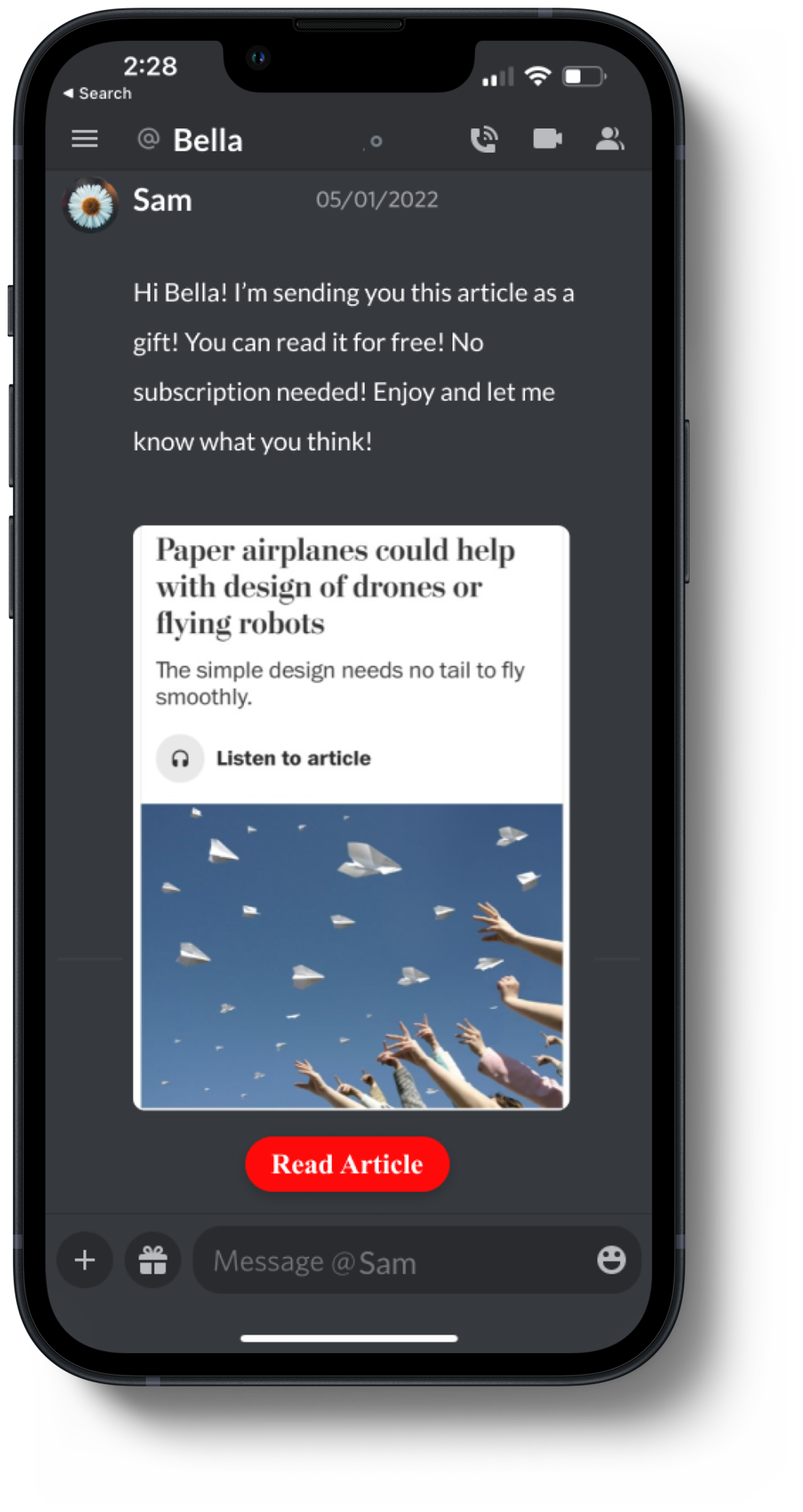
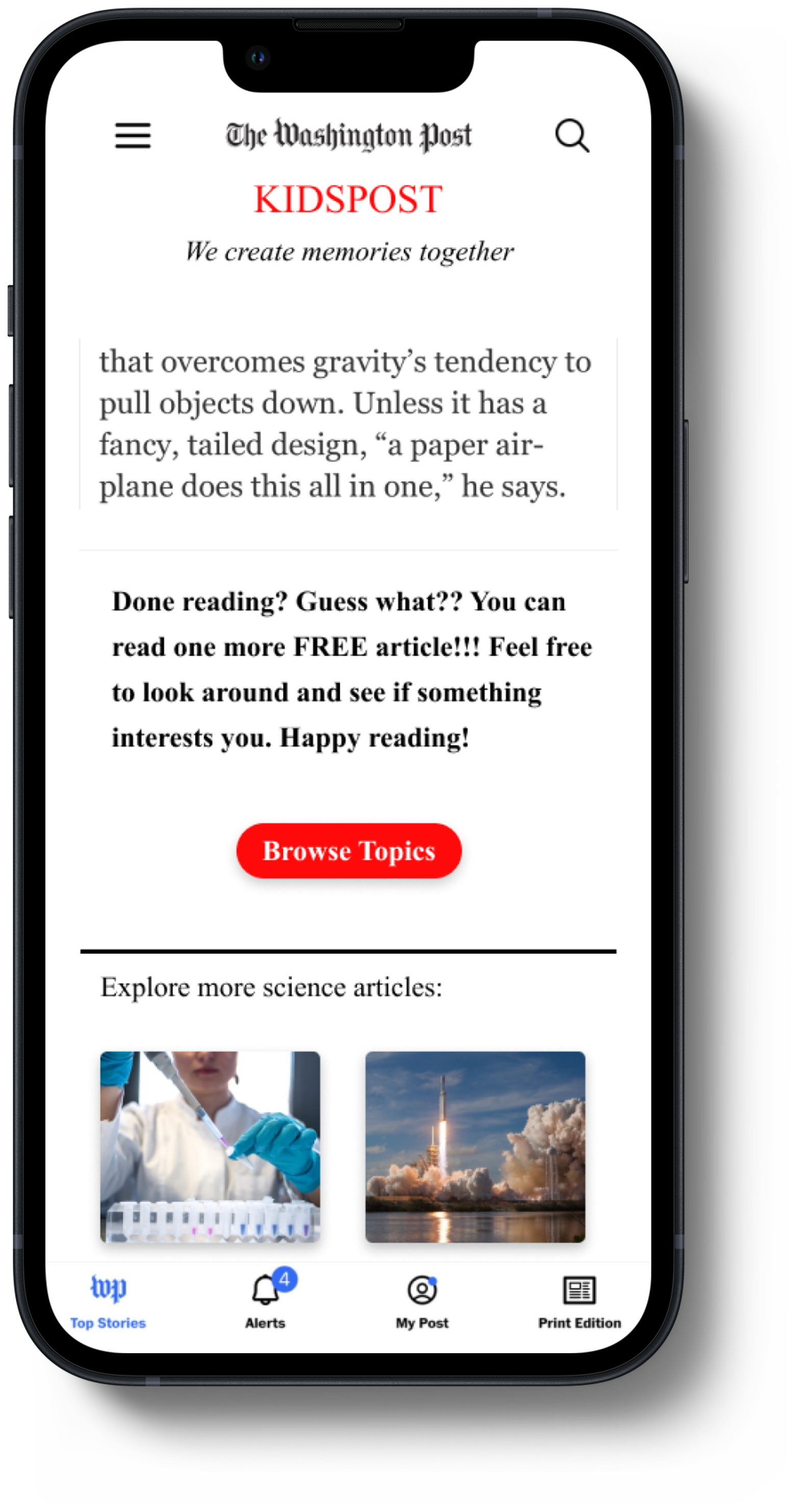
The prototype introduced a dedicated Kids’ section that is immediately visible within the app hierarchy, featuring a playful, customizable homepage, optional quizzes, and a “gift an article” feature. The goal was to create a space where curiosity, learning, and community naturally intersect, an experience that feels engaging to kids, with the business goal of targeting Gen Z readers in mind.
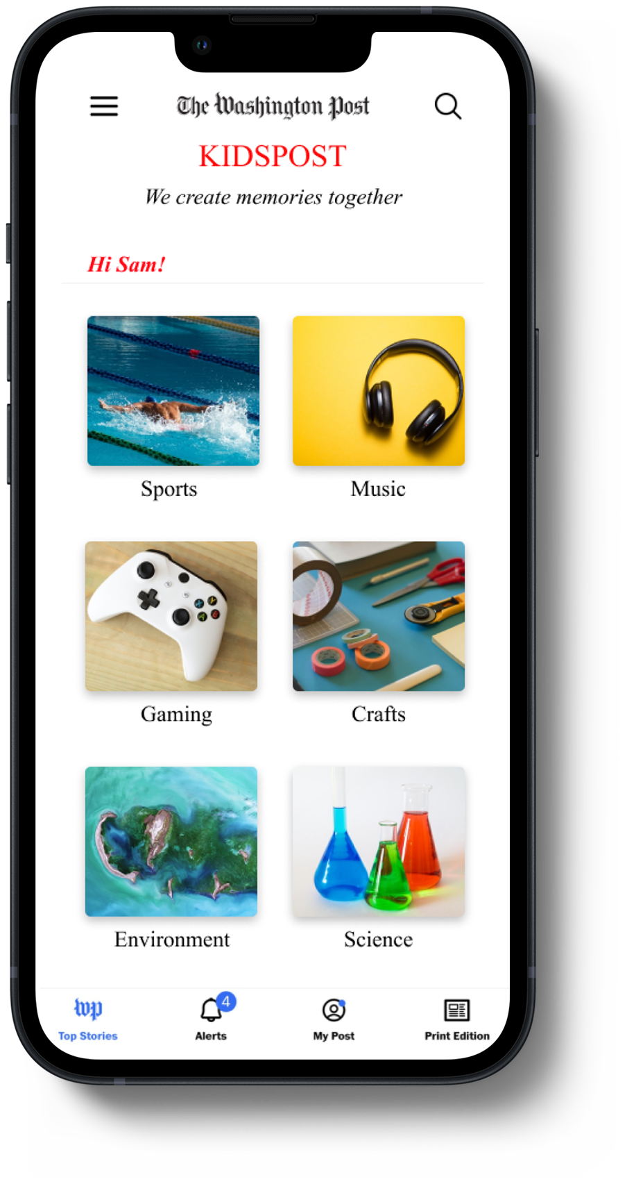

The new menu design features KidsPost as its own category (left), while the new homepage (right) introduces a playful, customizable layout for young readers.
Beyond visibility and customization, the redesign introduced a gamified reading experience where kids earn points by taking quick quizzes after each article. As points accumulate, their “expertise level” increases, unlocking the ability to “gift” articles to friends, a playful way to turn KidsPost into a community built on curiosity and kindness.
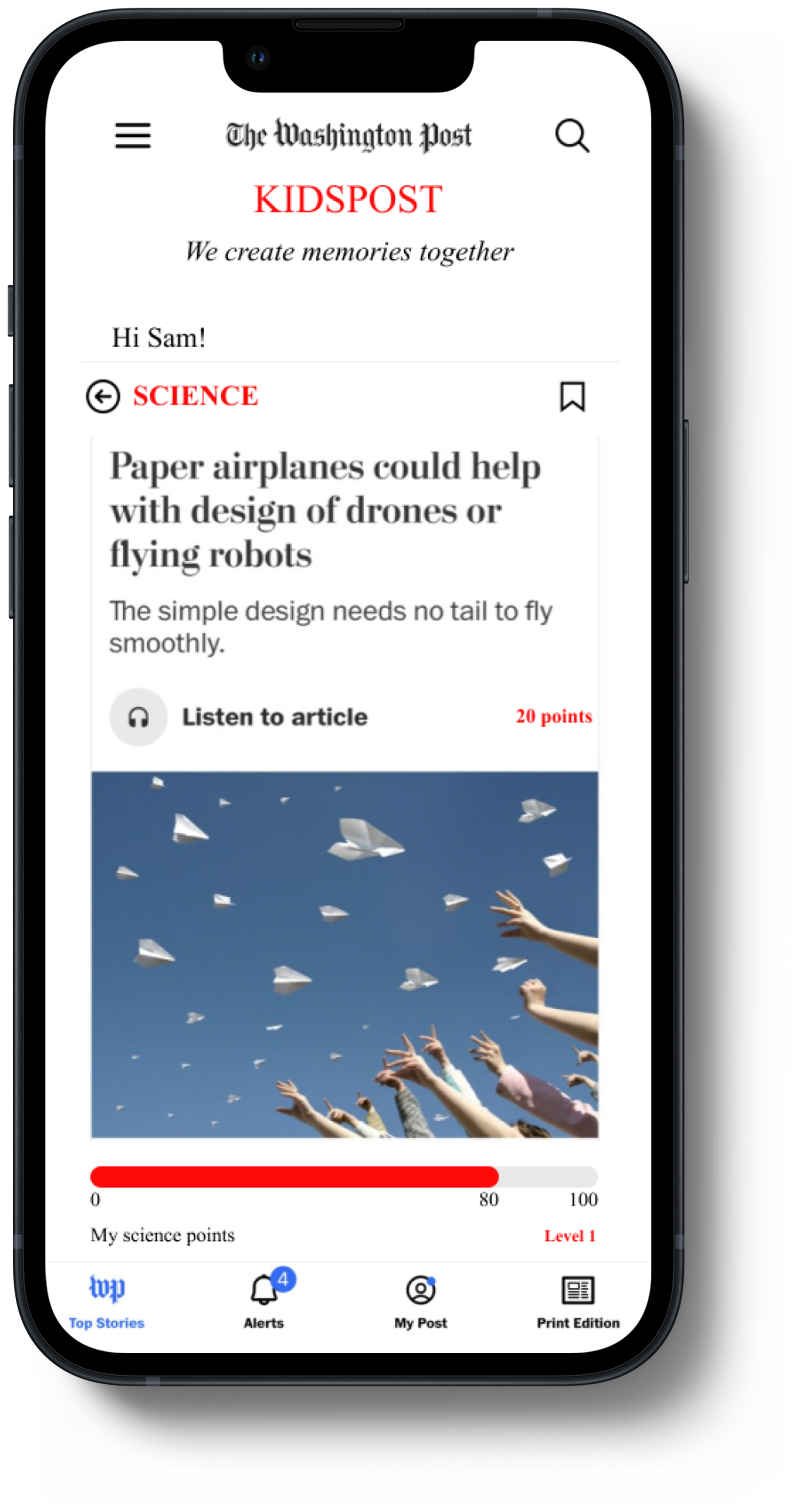
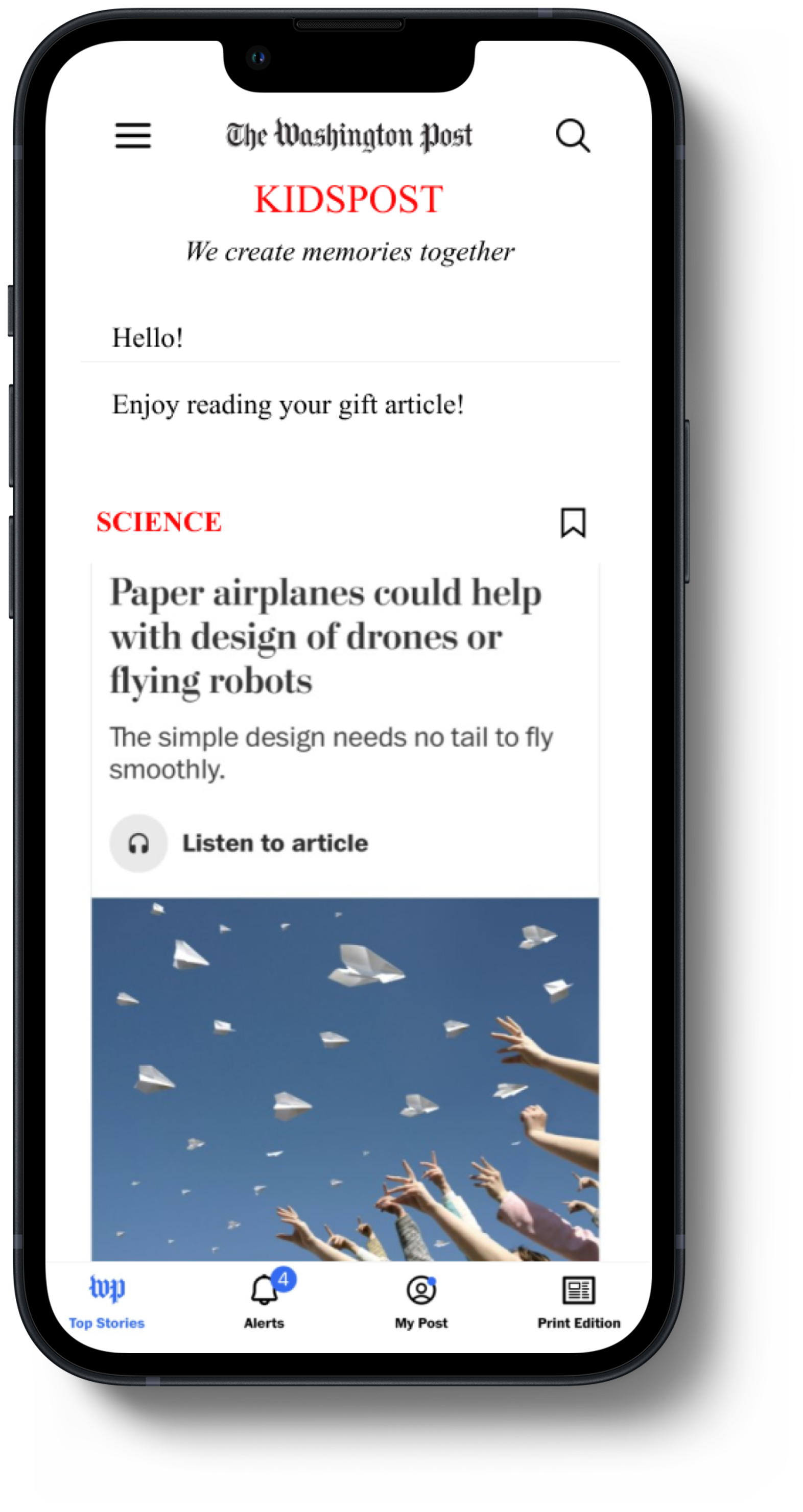
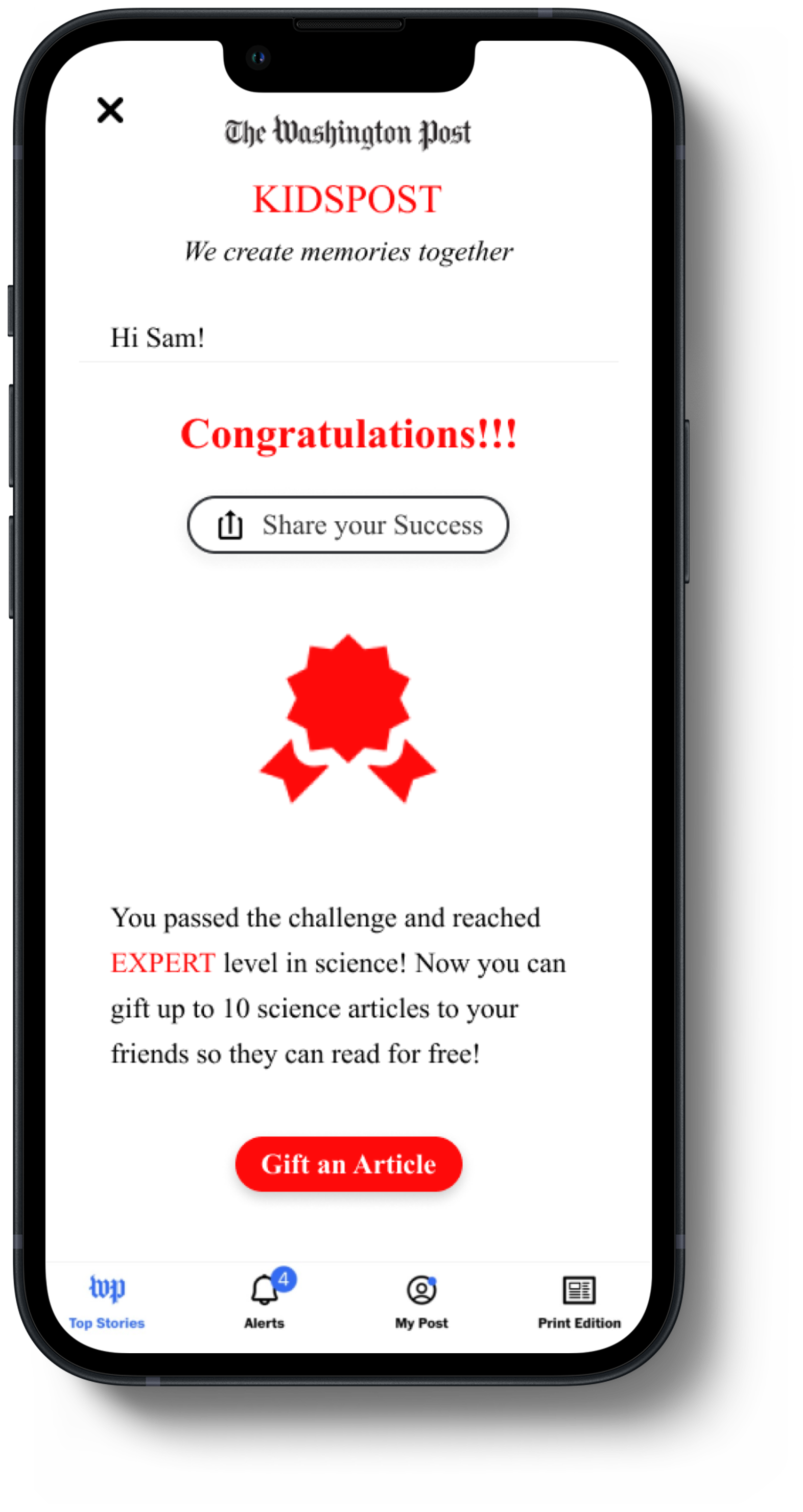
The “gift an article” feature was designed to extend engagement beyond the app, transforming personal achievement into social connection and community value. This places The Post at the heart of an emotional experience that fosters loyalty early on.

I designed this combination of features not only to delight and engage kids but also to support The Post’s long-term goal of attracting Gen Z subscribers.
Features of the new experience
Setting Up the Experiment
To understand how the proposed experience resonated with kids, I designed tri-fold testing sessions. The first part was an interview to explore their interests and digital habits. The second was a think-aloud test of the current KidsPost experience. The final part blended a walkthrough of the new prototype with a hands-on co-design activity. The goal was to gather early feedback on both desirability and usability. Three kids participated, enough to surface initial patterns and validate assumptions at this exploratory stage. All sessions were recorded with parental consent.
Testing procedures
Lessons from Testing
Testing confirmed several key hypotheses and surfaced meaningful tensions that guided the next iteration:
• Playful interfaces are key
Kids were instantly drawn to the redesigned home screen, its colors, and topics, even without guidance. This validated that emotional tone and visual engagement are critical for this audience.
• Confusion is not rejection
Some features (like quizzes and gifting) required brief verbal cues for children to understand the purpose and mode of interaction. Although the kids showed some confusion, they were still curious to understand how the experience works. This suggests future prototypes should experiment with micro-onboarding patterns rather than relying on kids’ instincts alone.
• Social reward is motivating
Successful challenge completion and gifting generated excitement, indicating that peer recognition and social interaction could be strong drivers of engagement, not just gamification for its own sake.

Snapshots from user testing (coded themes in Userbit, left) & user persona (right)
These findings directly informed the next design iteration, refining onboarding language, clarifying feature affordances, and tightening feedback cues, all to strengthen both emotional connection and user autonomy.
Iterating Meaningfully
Rather than addressing feedback in isolation, I grouped insights into two recurring themes and iterated on the design systematically.
Theme: Clarifying purpose & Expectations
Theme: Reinforcing feedback & progress
Missed Opportunities
Short-term signals vs. long-term engagement
WHY?
Testing focused on first impressions and short interactions. The long-term effects of challenges, progression, and gifting on curiosity and learning habits remain unexplored.
WHAT ‘S NEXT?
Conduct longitudinal testing to observe how kids’ engagement, comprehension, and sense of accomplishment change across repeated sessions.
Measuring joy and emotional resonance
WHY?
Joy and positivity were core to the experience and central to the hypothesis that early emotional connection could evolve into long-term trust and loyalty. While testing surfaced moments of excitement, curiosity, and pride, these signals were qualitative and short-term.
WHAT’S NEXT?
Investigate ways to measure joy and emotional resonance over time, combining behavioral indicators (voluntary return, exploration patterns), reflective prompts, and child-appropriate self-reporting, to better understand how joyful experiences translate into sustained engagement and relationship-building.
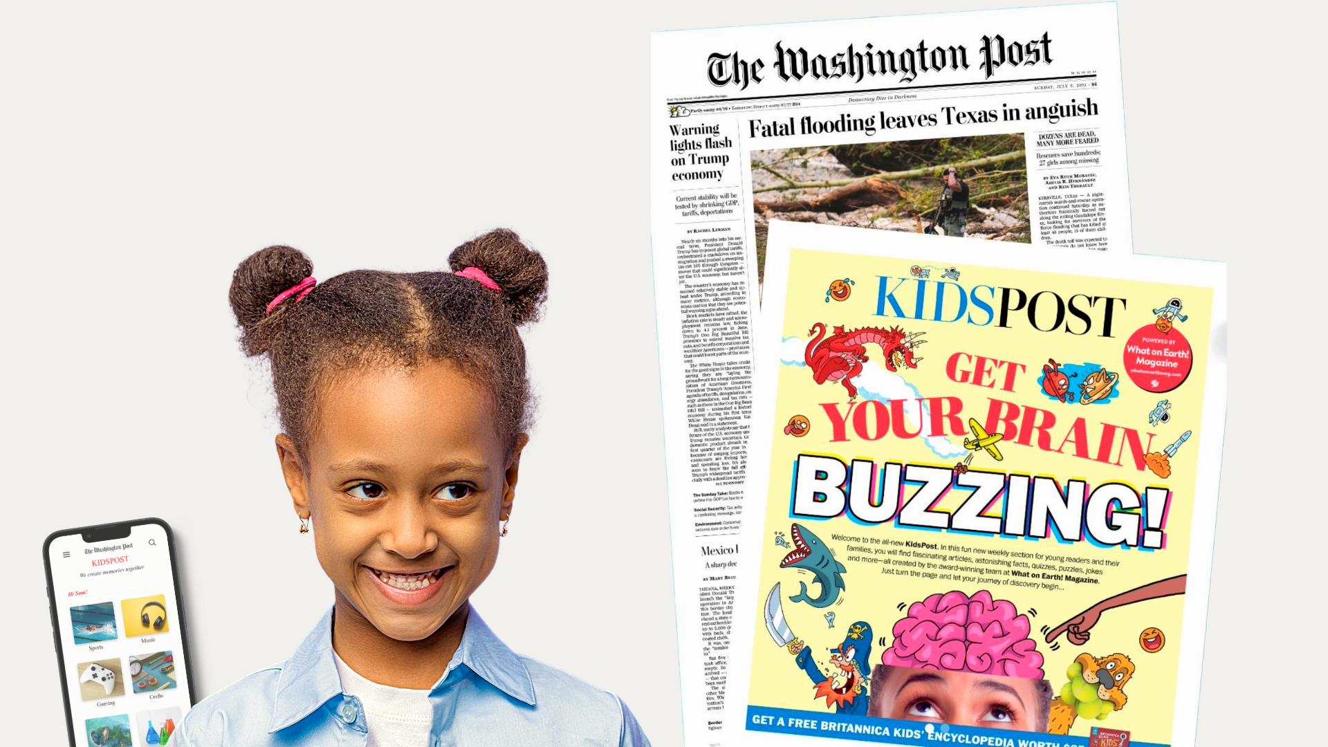
KidsPost Today
The Post vs The Times: Strategic Bets on Youth Engagement
Since this project, The Washington Post has relaunched KidsPost as a weekly print insert powered by What on Earth? magazine (its digital KidsPost section was closed in 2023 amid layoffs). The new edition embraces color, playfulness, and interactive content, quizzes, puzzles, and jokes, echoing the same values of fun, curiosity, and agency explored in my redesign. The New York Times, on the other hand, discontinued its own Kids section in 2025 to pursue other digital priorities.
These contrasting paths reinforce the core premise of this project: designing for kids is not simply a content decision, but a long-term product strategy. Investing in joyful, trust-building learning experiences early reflects a commitment to relationship-building rather than short-term returns.
This project helped me see how emotional design can be an intentional product strategy, one that reinforces human values while supporting long-term business goals.
More Projects
Uncovering Silent Barriers at Erewhon
Dismantling digital exclusion and resolving friction to create an inclusive experience
CRISP - Open Build
A systems approach to restoring trust and agency in grocery delivery