UXimize
Documenting a Product Design Journey
Role: Product Designer
Tools: Figma/FigJam
Duration: 7 weeks - 2025
Before you proceed
This project is not about the final design. It is about the process behind the design.
The Challenge
Design an app with an intuitive interface.
The Questions
This was the easiest part! I thought of something that would help me in my daily UX work. So, I decided to build an AI-powered app that creates time-consuming UX deliverables like website audits or competitive analyses in a few seconds. Then, I thought, why not include user modeling deliverables, like personas and user journeys? And, there, I had my app idea.
What app am I going to design?
2. How do I want users to feel?
Supported
Informed
In control
Delighted
3. What should this app communicate?
Reliability
Usefulness
Convenience
Delight
Building the app
AKA The Site Map. The site map is important! It helps you specify the structure of the app, the potential navigation routes and tasks. I went through three iterations of the site map as I was trying to avoid making the navigation too deep/complex. I also resisted the urge to overload the app with features so users get overwhelmed instead of feeling supported. In all cases, I decided on a dashboard layout where users move harmoniously through the different features without feeling stuck or confused. I was creating “an environment”.
Previous iterations
The inspiration

Now that I knew what kind of app I was going to build, I started looking for UI elements that I liked and felt would work well with the experience I wanted to create. Here is a snippet of my inspiration board.
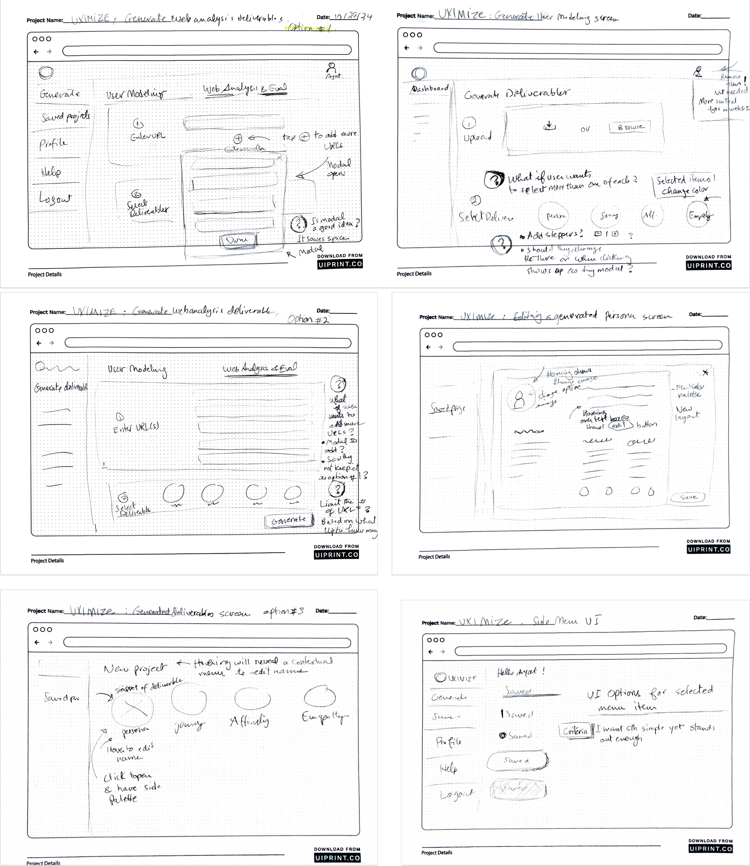
Sketching the wireframes
Next, I moved to sketching the wireframes. While working on layout options for each screen, the persistent questions were:
Does this make sense? Does it feel intuitive?
What task(s) does this screen support?
What are the top priority functions that a UX designer would need from this app?
What other scenarios are possible besides the current flow?
Does the screen feel clean or crowded?
Will the user be stuck anywhere in the experience?
How would people who are using this app feel?
What UI options feel the most intuitive and elegant?
Digitizing the lo-fi prototype
Moving from sketches to lo-fi digital wireframes involved revisiting some design decisions and not simply digitizing the existing sketches. This is what I love most about the process–how ever-evolving the design is and how new questions arise each step of the way!

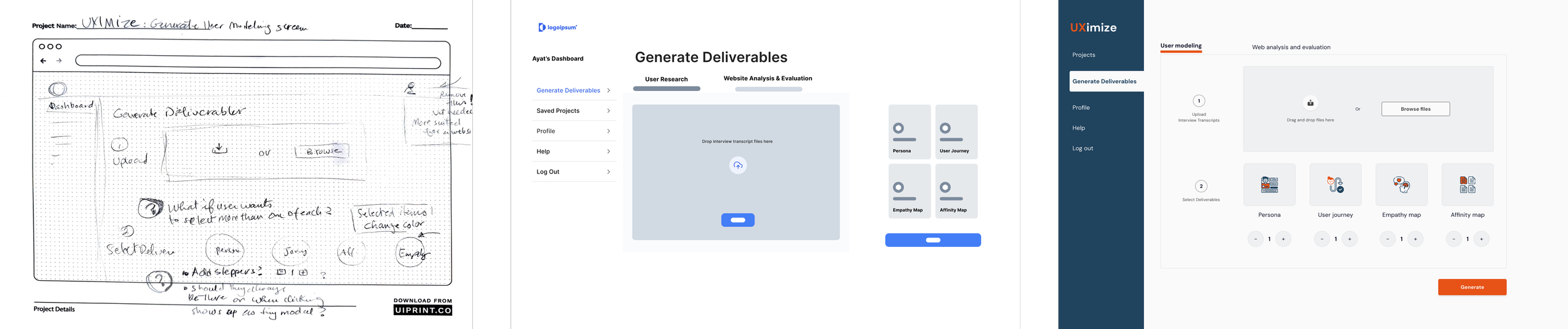
Finalizing the interface
App landing page, and new and existing user login
“Projects” page for new/existing user
“Generate Deliverables” page
Backstory
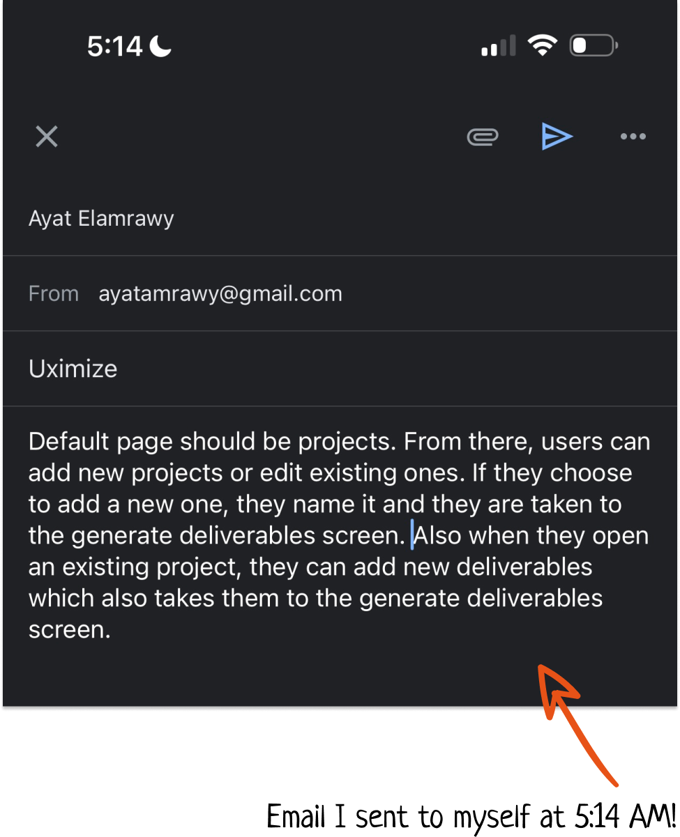
It took me some back and forth to decide which of these two pages would be the users’ default view once they log in. I was between two ideas:
1) Get the user directly to action! Send them directly to “Generate Deliverables”
2) Ease the new user into the experience by bringing them to the projects page where they can start a new project and then add deliverables to it.
I went with option #2 since the micropcopy I used on the “Projects” screen felt like some onboarding to the experience.
Additionally, I offered existing users the opportunity to start by generating deliverables and then saving them as a new project or adding them to an existing one.
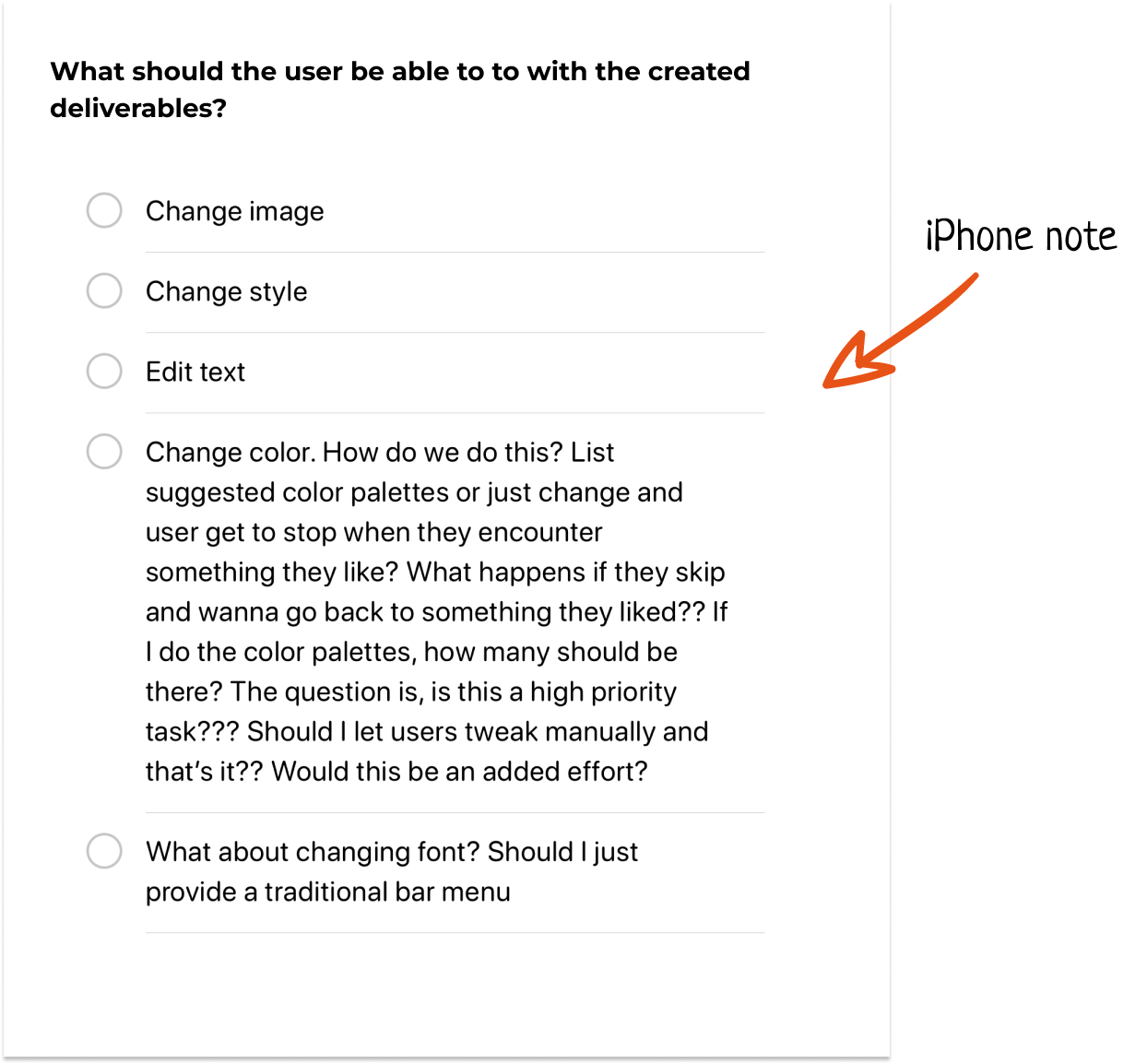
Editing a deliverable
Backstory
This was the trickiest page to design. I wanted the interface to be as intuitive as possible, and I also wanted to avoid crowding the screen with options. So I went with contextual CTAs that pop up upon hovering on any area of the persona. I also clarified that this is the expected interaction by adding “Click anywhere to edit”. I was inspired by Photoshop’s contextual menus, which made the app more approachable to new creatives.
The color palette
Backstory
I wanted a simple palette that communicates reliability and professionalism via the navy blue color, and energy, innovation, and creativity via the orange, in addition to the other basic shades.
What I learned
and next steps
When it comes to UI design, sometimes the fix to a problem is as simple as rearranging the screens of a given user flow, or changing the placement of a button. The whole design does not necessarily need to be reconsidered.
While trying to rationalize to reach each design decision in the interface, I realized that, sometimes, more than one rationale can “make sense” when explained. However, the biggest lesson I learn every time I design something is that no matter how much I believe my rationale makes sense, seeing how users interact with the design is the biggest eye-opener. So, I will test the app with a few people and see how much of my rationale actually makes sense, especially about navigation and UI decisions. And I will probably revisit my sketches and iterate, iterate, iterate…